A Nimble B2B Insurance Startup Values Genuine Dialogue
Vantage Risk, operating in the B2B sphere, may not be widely recognized by everyday consumers. The re/insurance market is dominated by slower, conservative giants. Yet, as a pioneering force in reinsurance. Vantage stands out for its creativity, data-driven, and deep human connection, prioritizing the people at the heart of the businesses they support. They collaborated with us to vividly express their core values and philosophy, and to revitalize their visual brand identity. This new identity is designed to be nimble and responsive, fostering more genuine dialogues with risk managers and key stakeholders of businesses they support.
Gold Winner
Digital Design for Graphic Design
Promotional Materials for Graphic Design
Silver Winner
Branding for Graphic Design
Branding for Services
Poster and Brochure Design for Graphic Design
Contribution
Brand Direction ( Jay Chang )
Graphic Design ( Jay Chang )
Copywriting ( Effie Peng )


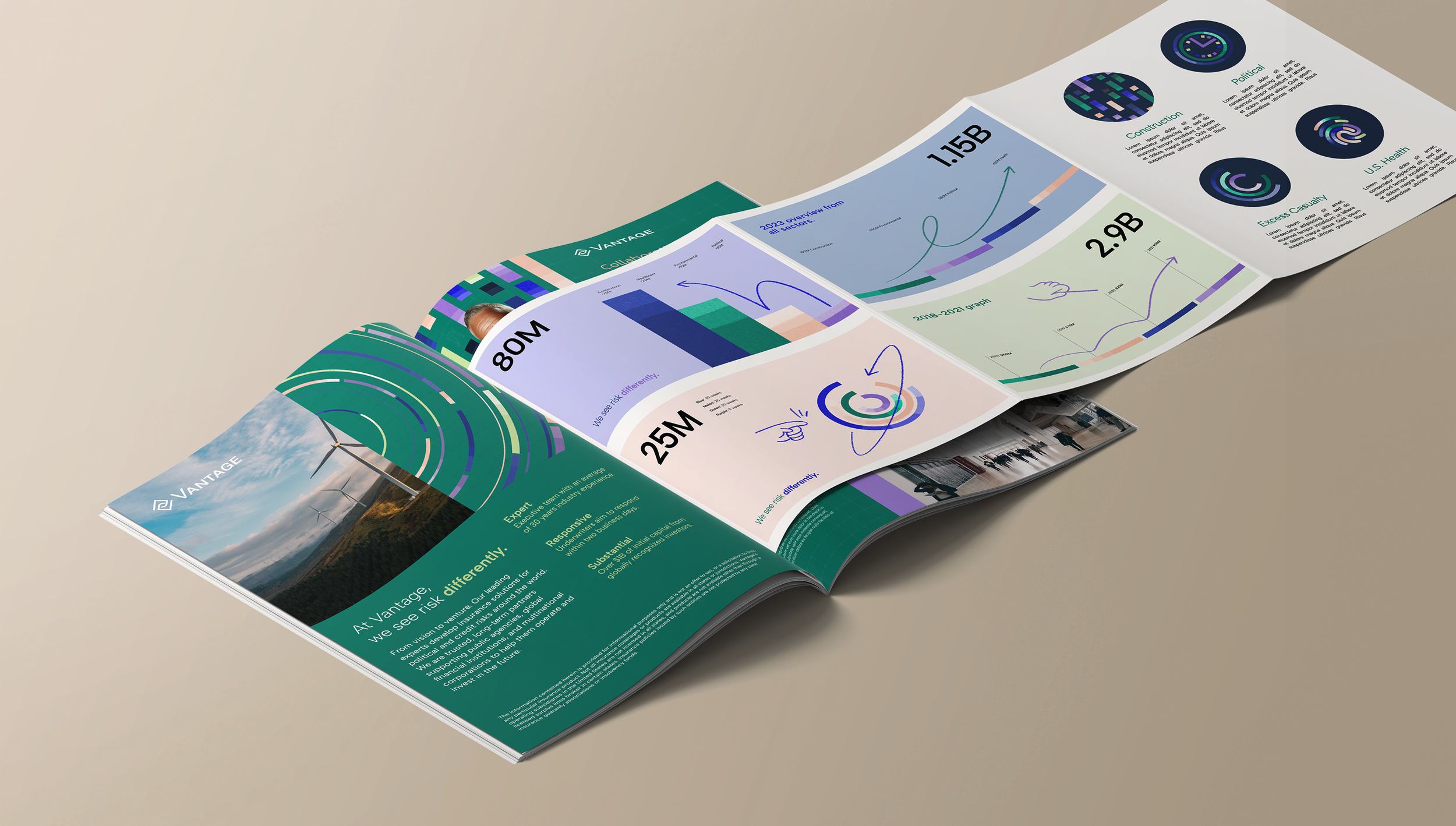
Crafting Data Essence Into Visual Patterns
How can we present data through a graphic design lens? Typically, data is visualized to provide insights, but our challenge is to convey the essence of data without using actual figures. To achieve authenticity, we explored charting tools commonly used by analysts, extracting elements like bars, lines, and pies. We then used these components to craft versatile compositions that mimic how data unveils patterns.


Tell Data Narratives in Human Voice
Data, in its raw form, are merely cold facts. It's the human element that breathes life into these numbers. To underscore this human touch, we layered an imperfect paint brush effect, and pencil strokes, creating more dynamic along the data lines. This not only adds an artistic flair but also symbolizes the human interaction and thought process involved in Vantage’s solution approach.


Color Shades
Typography


Primary ColorsSecondary Colors
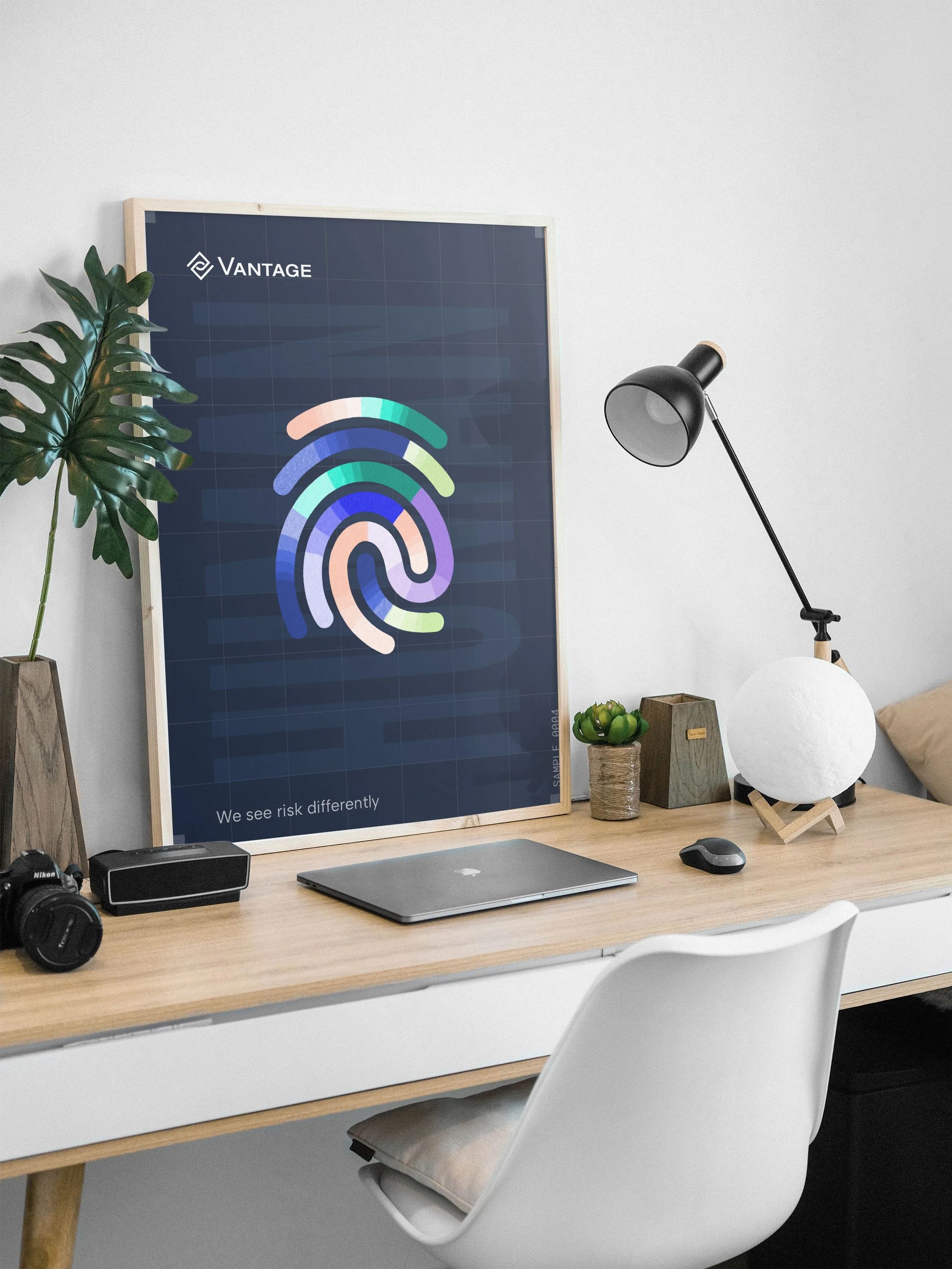
We see risk differently.
The Vantage tagline lockup, "We see risk differently," is crafted to highlight the word "differently" through a distinct text weight. By incorporating a unique color and accentuating the word with a pencil sketch line, we aim to create a more engaging and dynamic visual effect.


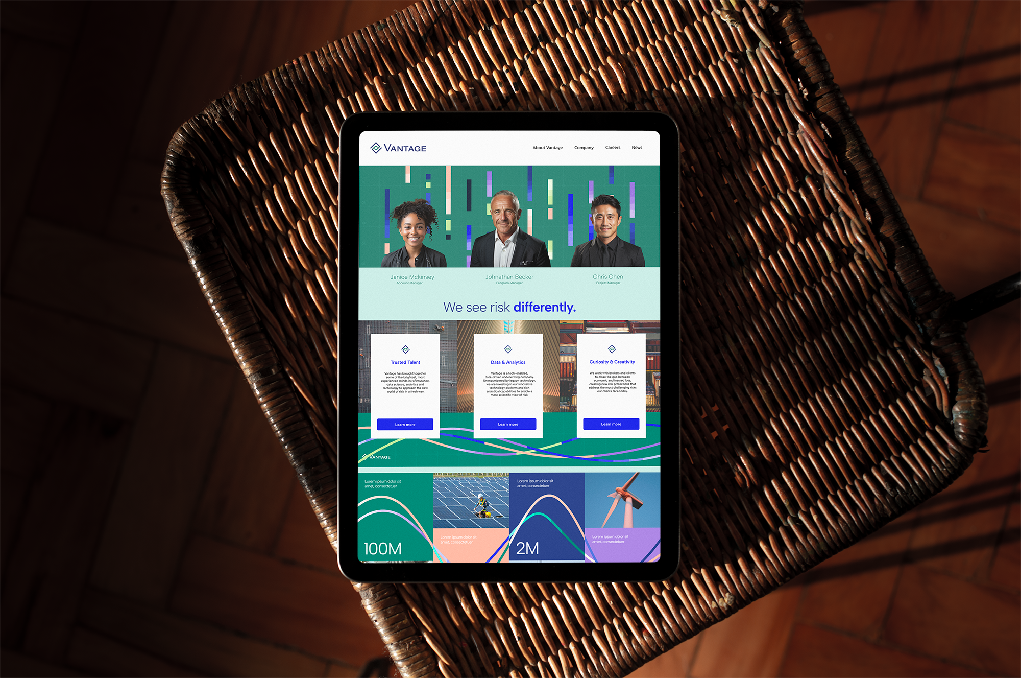
Marrying Concepts to the Real World: We See Risk Differently
To illustrate Vantage’s unique view of risk, we blend our custom visuals with industry photos. Extending the compositions of these original images, we apply our graphic treatment to create a seamless narrative that merges real-world scenarios with our data-driven concepts. This fusion highlights how Vantage discerns patterns in everyday life and expertly applies this insight back into tangible, real-world situations.


Vantage Iconographic