From a Commodity to Consumer Products
Behind the brand of Friends Village is a dedicated rice farmer Mr. Chen, whose life mission is to grow high-quality rice. With only 20% sugar content compared to regular rice, the health benefits of his rice are well recognized by hospitals around Taiwan, making him the primary supplier of the rice used in diabetic diets.
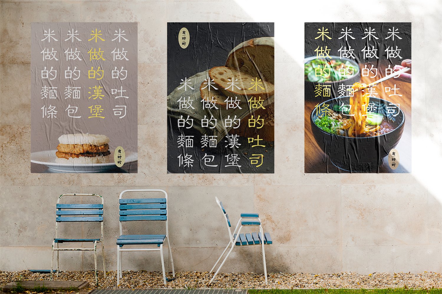
With the increasing demand for healthy diets, Mr. Chen saw the opportunity to serve and benefit more customers by making his low-starch rice into rice products, such as bread and pasta. His new products were able to gain traction from some local farmer's markets, but the growth plateaued quickly without a strong brand presence. To accomplish the transformation from producing a commodity to selling consumer products, Mr. Chen partnered with us to create a brand that people can recognize and trust.
Strategy
Branding
Packaging Design


Be Friendly to All
After many stakeholder interviews and workshops, we have identified “friendliness” as the core value and character of the brand. And the brand has been consistently practicing this friendliness to the land, the farmers, and the customers.
The brand is friendly to the land by growing crops organically without using pesticides; friendly to the farmers by entirely sourced and staffed from the locals; friendly to the customers by offering these healthier alternatives at affordable prices.
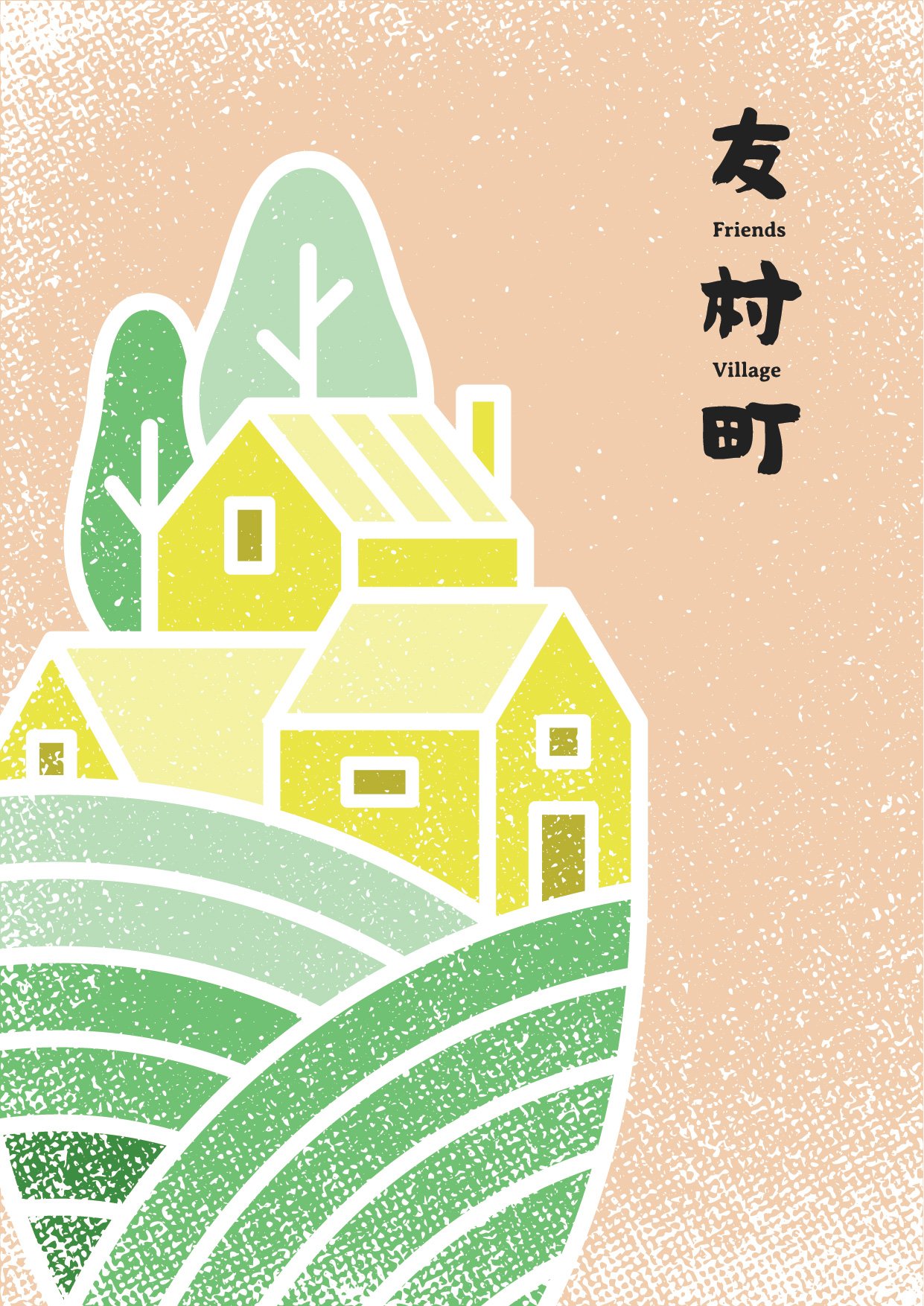
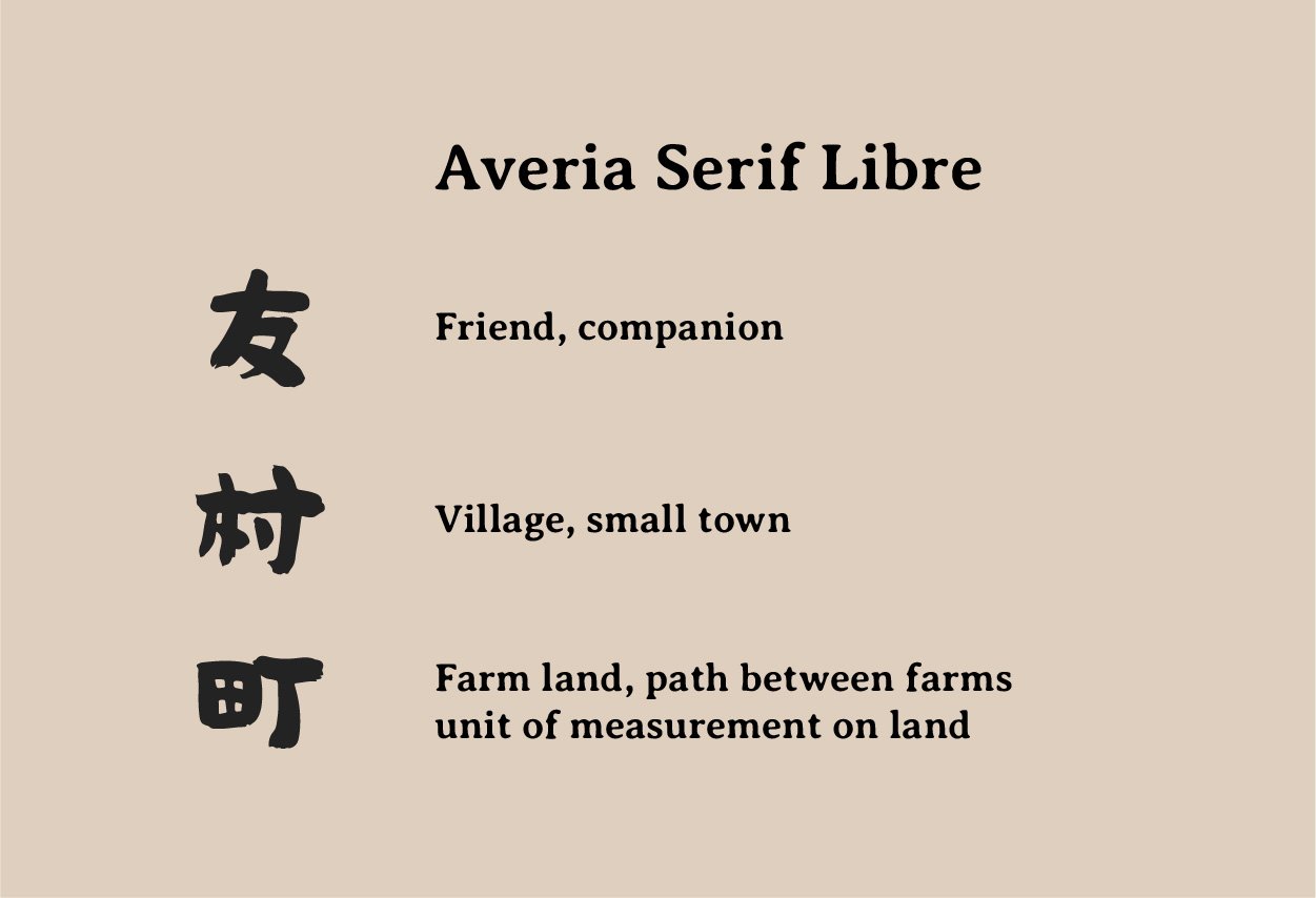
And here we got the name for the brand—友村町 (friends of the village and land).

The Beauty of Tradition
Farming is a time-honored practice, and we want the new logo to reflect the beauty of tradition. We would also like the new logo to quickly help the brand gain recognition. Hence, we chose to use Chinese calligraphy, combining purely visual art and interpretation of the literary meaning.
Chinese calligraphy is an art expression itself with thousands of unique writing styles. We went through countless styles to carefully land on the one that portrays the right look and feel. To make the characters more friendly and approachable, we have shortened and thickened the strokes, redistributed the weights, and rounded the edges, all as part of the customization.
For the English typeface, we chose to use Averia Serif Libre, a traditional rounded serif font, to achieve the equivalent look and feel of the Chinese calligraphy.


Extraordinary Done by the Nature
The unique features of a local environment always raise special characteristics to its inhabitants. The rice is grown in a remote town called Hualien, sitting on the foothill of the Central Mountain Range on the east side of Taiwan. The purity of the environment and the virtues in Hualien's culture make the products exceptional.
As we wanted to reveal this connection between the products and the environment that created them, we used the hand-drawn style visual elements of farm and village in pastel colors as the background of brand graphics.